Mastering Color Theory and Contrast

Great design communicates effectively, guides users intuitively, and stays accessible. Master these core principles: color theory, contrast, and visual hierarchy.
The Basics
The color wheel is your foundation. Use it to create intentional, professional color schemes.
Three main color harmony types:
- Monochromatic - Variations of one hue (sophisticated, cohesive)
- Complementary - Opposite colors (high contrast, vibrant)
- Analogous - Adjacent colors (serene, natural)
Color Psychology Quick Guide
- Blue: Trust, professionalism (finance, corporate)
- Red: Urgency, excitement (CTAs, sales)
- Green: Growth, health (wellness, eco-brands)
- Black: Luxury, sophistication (premium brands)
Contrast = Readability
Without contrast, your design fails.
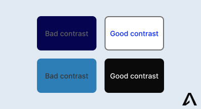
Accessibility Standards
WCAG is the web standard for defining accessibility guidelines.
- Normal text: 4.5:1 minimum
- Large text (18pt+): 3:1 minimum
- AAA level: 7:1 for normal text
Use contrast checkers before shipping. WebAIM Contrast Checker and browser DevTools are free.
Do This
- Use sufficient color contrast (4.5:1 minimum for text)
- Test with accessibility tools before shipping
- Keep focus states visible for keyboard users
Don't Do This
- Use low contrast text (light gray on white)
- Remove focus outlines without providing alternatives
- Ignore responsivness for mobile users
Monochromatic Design
One powerful way to master contrast and hierarchy? Try monochromatic design. When you limit your palette to black, white, and grays, you force yourself to rely on contrast, spacing, and hierarchy rather than color as a crutch.
Benefits:
- Timeless aesthetic that never goes out of style
- Enhanced content focus without color distraction
- Premium and polished appearance
Create depth with:
- Glassmorphism effects for layered interfaces
- Typography weight variations to establish hierarchy
- Subtle shadows and borders for definition
- Animations and transitions for interactivity
While glassmorphism can create a premium aesthetic, it requires careful implementation to maintain proper contrast ratios and ensure text remains readable over blurred backgrounds. Always test with real content.
Key Takeaways
- Master the color wheel and harmony types
- Always meet WCAG contrast ratios (4.5:1 minimum)
- Establish clear hierarchy with size and weight
- Use white space strategically
- Test accessibility before launch
Start with these fundamentals, test and iterate based on user feedback.